

A refined online destination bringing a boutique fashion experience to the digital space.
1. The Vision – Merging Style with Simplicity
Idhika isn’t just a clothing label — it’s a statement of taste. The objective was to build an online store that feels like browsing through an upscale fashion showroom, where every product is given space to shine, and customers can move effortlessly from discovery to purchase.
The brand wanted a website that inspires browsing, narrates seasonal stories, and makes buying almost instinctive.
2. Mapping the Shopper’s Mindset
-
Target Audience: Modern, trend-aware buyers with a preference for curated collections.
-
Challenges Addressed:
-
Overcrowded layouts common in mass-market e-commerce.
-
Limited mobile usability in competitors’ sites.
-
Lack of seasonal campaign integration.
-
The solution was a clean, airy, and well-structured interface that makes fashion the hero.
3. UI/UX Design Direction
Color Palette & Visual Language
-
Pastel Pink (#F7CAC9) – Soft elegance for the women’s range.
-
Powder Blue (#92A8D1) – Minimal yet bold for men’s collections.
-
White (#FFFFFF) – A neutral canvas to spotlight products.
Typography:
-
Elegant sans-serif headings for a modern look.
-
Clean, high-legibility body fonts for descriptions.
Page Flow & Key Features
-
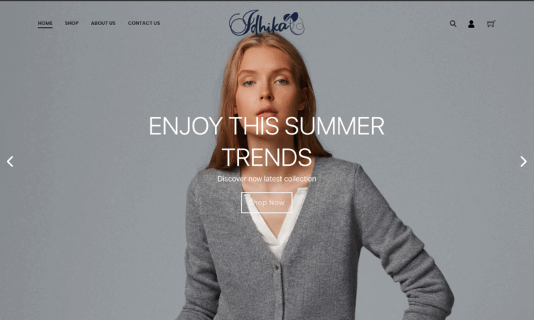
Immersive Hero Slideshow – Showcasing seasonal campaigns in full width.
-
Quick Access Category Tiles – Women, men, shoes, accessories, each visually distinct.
-
Bestseller Focus – Highlighting products like the Azure Tote with clear pricing.
-
Sales & New Collection Promos – Integrated without overpowering browsing.
4. Technical Backbone
-
Platform: WooCommerce with WordPress for flexibility.
-
Mobile-first responsiveness ensuring a fluid experience on all devices.
-
Quick Add-to-Cart & Secure Checkout for reduced purchase friction.
-
Optimized product photography with zoom for detail inspection.
5. Shopper-Centric Enhancements
-
Visual hierarchy that naturally draws attention to trending and seasonal products.
-
Balanced whitespace to avoid overwhelming the user.
-
Storytelling via homepage refreshes tied to seasonal drops.
6. Results & Brand Impact
-
Increased user engagement time due to editorial-style browsing.
-
Higher conversion rates for spotlighted items.
-
A clear alignment between digital presence and brand identity.
7. Takeaways
This project reinforced how strategic simplicity can elevate an e-commerce brand, making every interaction feel premium while keeping usability front and center.
Project Summary
-
Category: UI/UX Web Design – E-Commerce (India)
-
Role: Visual design, UX optimization, e-commerce integration
-
Outcome: Elevated brand perception, improved sales performance, smoother customer journeys
-
Demo Website: idhika.meoun.com