


Crafting a User Experience That Inspires Dreams and Simplifies the Study Abroad Journey
1. Project Vision – Turning Aspirations into Clickable Pathways
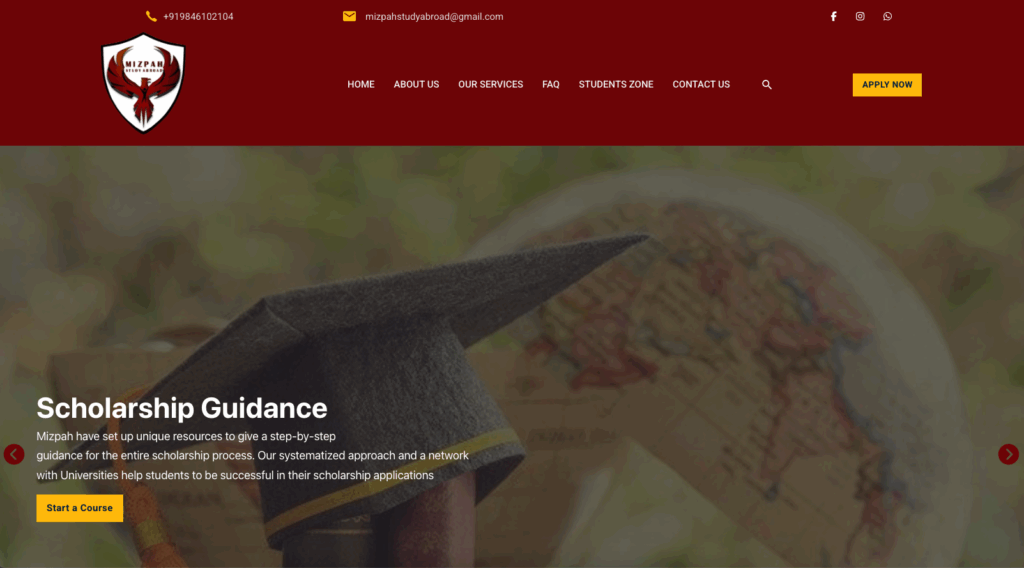
Mizpah Study Abroad needed a credible, informative, and emotionally engaging platform to connect with Indian students aspiring to study in the UK and other international destinations.
Core objectives:
-
Present clear program offerings and scholarship details.
-
Build trust through testimonials and recognisable partner universities.
-
Provide quick, simple enquiry options.
2. Audience Understanding – Speaking to Students and Parents
Target users:
-
Students exploring higher education abroad.
-
Parents/guardians seeking safe, reliable guidance.
-
Educational partners looking for recruitment collaboration.
Design priorities:
-
Make navigation logical for non-tech-savvy parents.
-
Highlight success metrics and real student stories.
-
Ensure the interface works smoothly on mobile, where most inquiries originate.
3. UI/UX Approach – Trust Meets Clarity
a. Color Palette & Typography
-
Deep Maroon (#7B001C) – Authority and tradition.
-
Bright Yellow (#FFD230) – Energy and opportunity.
-
White (#FFFFFF) – For balance and clean section separation.
-
Formal, serif-inspired headings paired with easy-to-read sans-serif content.
b. User Flow
-
Hero Section: Inspirational graduation imagery + bold scholarship/visa assistance CTA.
-
Why Study in the UK: Visual flag representation + bullet-point advantages.
-
Welcome Message: Emotional brand introduction.
-
University Showcase: Grid of top partner institutions.
-
Quote Request Form: Simple fields for quick conversions.
-
Metrics & Testimonials: Proof of success.
-
Final CTA: Join student network prompt.
4. Technical Implementation
Platform: WordPress with fully responsive grid layouts.
Performance Features:
-
Lazy loading of high-res university images.
-
Optimized form scripts for faster submissions.
Lead Capture Tools:
-
Contact forms in both header and mid-page.
-
Sticky apply button for constant accessibility.
5. Challenges & Solutions
-
Challenge: Appeal to both tech-savvy youth and cautious parents.
Solution: Structured pages with clear headings for parents, plus engaging imagery for students. -
Challenge: Converting interest into applications.
Solution: Strategically placed CTAs and short, clear forms to reduce drop-offs.
6. Impact
-
Higher engagement from mobile users.
-
Increased quote requests within the first month of launch.
-
Improved brand trust via visual alignment with partner universities.
7. My Takeaways
This project reinforced how education portals must combine clarity, credibility, and inspiration. The right mix of emotional storytelling and functional design makes students confident and parents reassured.
Project Snapshot
-
Category: UI/UX Web Design – Education (India)
-
Role: User journey mapping, brand-focused design, mobile optimization
-
Impact: Boosted leads, improved trust factor, strong student engagement
Demo Website: mizpahstudyabroad.meoun.com