

Where Swedish Precision Meets UI/UX Simplicity
1. The Project Brief – A Digital Front Door for a Local Cleaning Brand
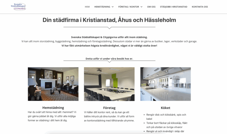
Citypigorna is a cleaning company operating in Kristianstad, Åhus, and Hässleholm in Sweden.
Their business is built on trust, punctuality, and quality — but their existing digital presence didn’t reflect that reliability.
The goal was simple yet challenging:
-
Create a UI/UX design that feels clean, minimal, and Scandinavian.
-
Make it easy for customers to understand services and contact the company instantly.
-
Build trust through clarity and visual honesty.
2. Understanding the Local Culture – Designing for Sweden
In Sweden, design expectations differ from many other markets:
-
Function first: People expect a website to work intuitively without “figuring it out”.
-
Minimalism: Clean, white space is not “empty” — it’s essential.
-
Transparency: Clear service descriptions, contact details, and credibility indicators are a must.
This cultural context shaped every design decision.
3. UI/UX Design Approach – Less but Better
a. Visual Identity
-
Colors:
-
White (#FFFFFF) – Cleanliness and simplicity
-
Light Gray (#F6F6F6) – Soft background to avoid harsh contrast
-
Deep Gray/Black (#1F1F1F) – Professional and modern text contrast
-
Accent Purple (#9E4DA0) – Distinct brand personality without overpowering
-
-
Typography:
-
Modern sans-serif for clarity and approachability
-
Consistent font sizing for easy scanning
-
-
Imagery:
-
Real-life images of interiors, office spaces, and kitchens — authentic rather than stock-heavy
-
b. Navigation Flow
-
Hero Banner: Immediate call to action — “Hör av dig idag!” (“Contact us today!”)
-
Service Overview: Home cleaning, office cleaning, kitchen deep cleaning — clearly segmented
-
Trust Statement: Awards, credibility rating, and pride statement
-
Map Integration: Interactive Google Map showing service coverage
-
Contact Form: Simple, short, and always visible near the bottom
4. Technical Implementation
Platform: WordPress CMS for flexible content management
Design: Minimalist custom template optimized for Scandinavian UX preferences
Performance Optimization:
-
Lightweight build for faster load times
-
Responsive layout for mobile and desktop
-
Optimized imagery for clarity without sacrificing speed
SEO Targeting:
-
Localized keywords in Swedish for cleaning services
-
Proper meta titles and alt tags for accessibility
5. Challenges & Solutions
-
Challenge: Balancing minimalism with enough personality to stand out.
Solution: Used a subtle accent color (purple) to reinforce brand identity without breaking the clean aesthetic. -
Challenge: Making the site functional for all age groups.
Solution: Increased font sizes, high-contrast text, and clear click/tap targets. -
Challenge: Encouraging direct contact.
Solution: Contact details are repeated strategically — in the hero banner, footer, and alongside the form.
6. Impact – A Scandinavian Standard of Clarity
Since launch:
-
Clients report the site feels “tidy” and “easy to use” — exactly the qualities they expect in a cleaning brand.
-
Contact form submissions increased due to frictionless navigation.
-
The site now reflects the company’s high credit rating and reputation.
7. My Takeaways
This project reminded me how local cultural norms directly influence UI/UX success.
In Sweden, honesty in presentation is just as important as design aesthetics. Every element had to reflect functionality, transparency, and trust.
8. Project Snapshot
-
Category: UI/UX Web Design – Local Service Business (Europe)
-
Role: UI/UX design, localization, SEO optimization, mobile-first development
-
Region: Sweden
-
Impact: Increased trust, improved local lead generation, culturally aligned user experience
Live Demo: rentboende.meoun.com