From Word-of-Mouth to World-Ready
1. The Backstory – A Local Service with Big Aspirations
A1 Digi Services wasn’t a Silicon Valley startup or a well-funded agency.
It was a local, hard-working service provider that relied entirely on word-of-mouth to get customers. Their services were good — reliable, affordable, and trustworthy — but their reach stopped at the neighborhood.
When they approached me, it wasn’t about “digital marketing” in the buzzword sense.
It was about survival and growth.
They wanted an online space that said:
“Here’s what we do, here’s how we can help you, and here’s why you can trust us.”
The catch? They had no budget.
So I decided to take this on as part of my Public Help & Support work — because every good business deserves a chance to shine.
2. Understanding the Audience – Designing for Real People
The A1 Digi Services audience wasn’t made up of corporate executives or tech enthusiasts.
It was everyday people:
-
Small shop owners needing printing or digital assistance
-
Students looking for affordable document services
-
Families needing local IT help
This meant the website needed to be:
-
Straightforward: No complex navigation
-
Informative: Services listed clearly
-
Accessible: Works on any device, even with low-speed internet
3. The Design Approach – Simple, Bold, Effective
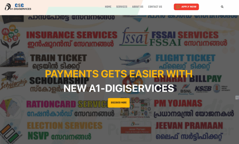
a. Visual Identity
-
Colors:
-
Royal Blue (#1F4E79) – Professionalism and trust
-
White (#FFFFFF) – Clarity and readability
-
Accent Orange (#FF9800) – Warmth and attention-grabbing for CTAs
-
-
Typography:
-
Clean, modern sans-serif — friendly yet credible
-
Generous line spacing for easy reading
-
-
Imagery:
-
Service-related icons for instant recognition
-
Simple photography to humanize the brand
-
b. Navigation Flow
-
Hero Section: Quick introduction + core service promise
-
Services Grid: Visual cards with each offering explained in plain language
-
Why Choose Us: Short bullet points to build trust
-
Contact Section: Click-to-call phone number, contact form, Google Maps embed
4. Technical Build
Platform: WordPress
Theme Base: Lightweight, responsive theme customized for A1 Digi branding
Page Builder: Elementor (for easy content editing later)
Performance Optimizations:
-
Image compression for fast load
-
Minimal plugin footprint to reduce bloat
-
Mobile-first approach for better performance on older devices
SEO Basics:
-
Local keyword targeting (“digital services in [city]”)
-
Structured headings for Google indexing
-
Alt text and meta descriptions for each page
5. Challenges & Creative Fixes
-
Challenge: No professional brand assets or photography.
Solution: Created a mini design system from scratch and sourced license-free images. -
Challenge: Client had never used a website before.
Solution: Provided a simple admin training so they could update service details themselves. -
Challenge: Needed a professional look without overwhelming the user.
Solution: Focused on content clarity and limited the color palette for a clean visual hierarchy.
6. The Result – Digital Confidence
With the launch of A1 Digi Services’ website:
-
They could finally share a link instead of explaining services verbally each time.
-
They received inquiries from outside their local area — something impossible before.
-
Their credibility improved instantly — people saw them as a serious, reliable service provider.
The owner’s words still stick with me:
“I never thought a small business like mine could have something that looks this professional.”
7. My Takeaways
From a design perspective, this reinforced that simplicity wins when your audience just wants quick, clear information.
From a human perspective, it reminded me how digital access can transform opportunities — even for the smallest local businesses.
8. Project Snapshot
-
Project Type: Public Help & Support – Local Digital Services
-
Role: Design, development, and training
-
Budget: Free (community support)
-
Impact: Increased inquiries, improved trust, expanded reach
Live Demo: a1digiservices.meoun.com


