
A Story of Vision, Design, and Digital Craftsmanship
1. How It All Began – The Call to Make a Difference
It started with a conversation.
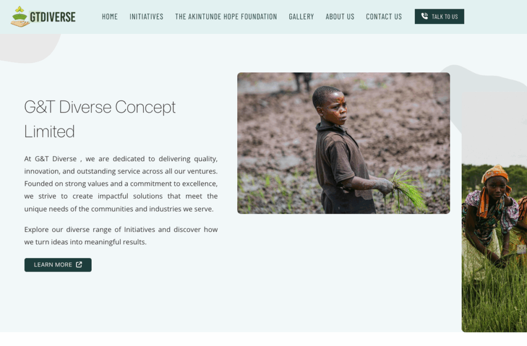
An NGO based in Lagos, Nigeria — GT Diverse Concept Limited — reached out with a heartfelt mission:
“We want a platform that reflects our soul. A place where people can see who we are, what we stand for, and how they can be part of the change.”
I’ve built e-commerce sites, marketing platforms, and corporate dashboards… but this was different.
This wasn’t about conversion funnels or ad ROIs.
This was about stories, trust, and hope.
From the first meeting, I knew this project had to do more than look good — it had to inspire action.
2. Understanding the Heartbeat – Research & Discovery
Before opening Figma or touching a line of code, I dove deep into:
-
The NGO’s core values: Empowerment, Education & Equity.
-
Their audience: Farmers, students, educators, and local leaders.
-
Their goals: Showcase initiatives, attract partners, and facilitate easy contact.
I spent hours reading their mission statements, understanding their foundation (The Akinrutide Hope Foundation), and even mapping the emotional journey a visitor might take when landing on their site for the first time.
This became the blueprint for the site’s structure and tone — clear, warm, and purpose-driven.
3. Crafting the Experience – UX Design as Storytelling
I approached the UI/UX like a narrative:
-
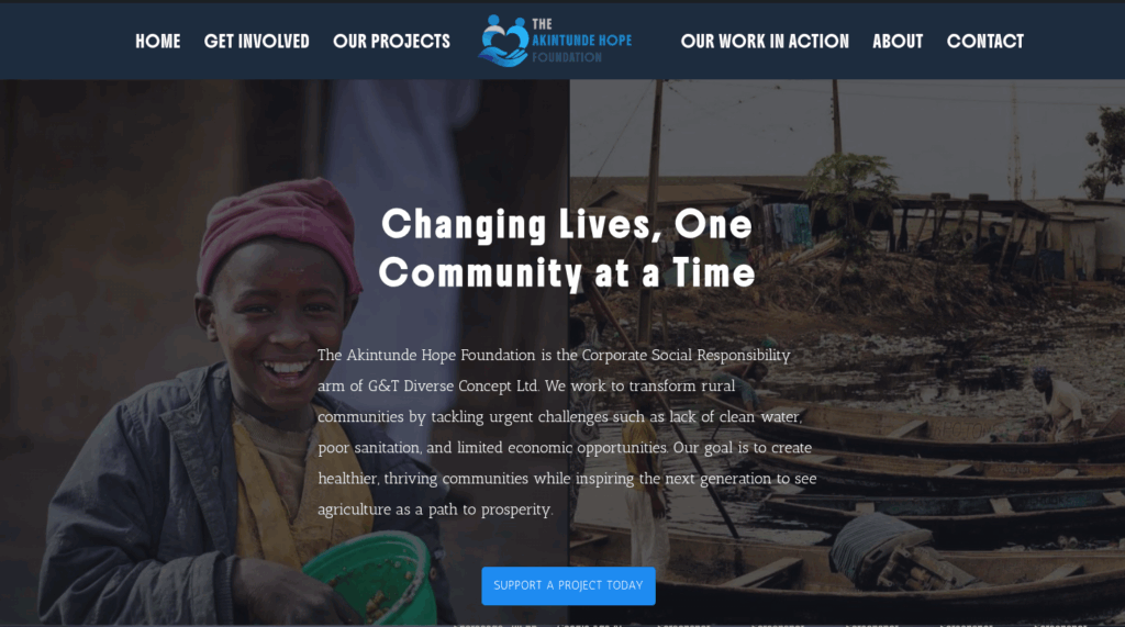
Act 1 – Introduction: The hero section tells their story in one glance — a real-life image, a bold headline, and a call-to-action.
-
Act 2 – Understanding: Sections like Who We Are and Empowering Growth Through Diversity draw visitors in, revealing their purpose layer by layer.
-
Act 3 – Engagement: Detailed programs, community initiatives, and a personal invite to join the cause.
-
Act 4 – Connection: A clean, friendly contact section with a map that says, “Yes, we are real, and here’s where to find us.”
The aim was to make visitors feel the cause before asking them to take action.
4. The Visual Identity – Colors, Fonts, and Emotion
Colors weren’t chosen randomly; they were psychology in action:
-
Primary Green (#2E5B4E): Trust, growth, and sustainability.
-
Light Pastel Green (#CDE1D0): Calmness and approachability.
-
Warm Gold (#F6C344): Optimism and action.
Typography followed the same thought process:
-
Headings: Bold sans-serif — confidence and clarity.
-
Body: Modern, readable sans-serif — comfort and accessibility.
Images were handpicked to be authentic, not staged — showing real people, real farms, and real moments.
5. Building the Backbone – Technical Implementation
While the site looks simple on the surface, under the hood it’s optimized for speed, scalability, and SEO.
Tech Stack & Tools:
-
CMS: WordPress (chosen for flexibility and easy content updates for the NGO team).
-
Builder: Elementor (to allow non-technical team members to make changes).
-
Framework: Bootstrap grid for responsive design.
-
Plugins: Contact Form 7, WPForms, Yoast SEO, Google Maps Embed.
-
Hosting: SSL-enabled secure hosting.
-
Performance: Image compression, lazy loading, and caching to achieve sub-3s load times.
SEO & Accessibility:
-
Semantic HTML5 structure
-
WCAG-compliant contrast ratios
-
Descriptive alt text for all images
-
Metadata & schema markup for better search visibility
6. Challenges & Creative Problem-Solving
-
Challenge: The NGO’s initial content was scattered and text-heavy.
Solution: I restructured it into bite-sized, scannable sections with strong visuals. -
Challenge: Limited branding assets.
Solution: I developed a mini design system — colors, typography, iconography — to ensure visual consistency across the site and future campaigns. -
Challenge: Ensuring the site could be easily updated by the NGO without breaking design.
Solution: Created custom reusable blocks in Elementor, locked key style settings, and recorded short training videos.
7. The Moment of Launch – Seeing the Impact
When the site went live, the NGO’s feedback was immediate:
“It feels like we finally have a home on the internet.”
The first week saw:
-
Increased inquiries from potential partners.
-
More people signing up for initiatives.
-
Positive comments from community members about the professional yet heartfelt design.
8. My Takeaways from GT Diverse
This project reminded me that design is not just pixels; it’s purpose.
It’s not just about making something look beautiful — it’s about making it mean something.
From a purely professional standpoint:
-
I reinforced my UI/UX storytelling skills.
-
I deepened my ability to translate organizational values into digital design language.
-
I refined my WordPress customization workflow for NGOs.
From a personal standpoint:
-
I learned that sometimes, the smallest design choices — like showing a farmer’s smile or a student’s graduation photo — can make the biggest emotional impact.
9. Final Showcase
-
Live Site: gtdiverse.com
-
Role: End-to-end design & development
-
Deliverables: Website, design system, admin training
-
Impact: Created a credible, inspiring platform to attract support and drive engagement for GT Diverse’s mission.